


ClickSold is a turnkey real estate website solution for any agent or office, built on the powerful WordPress platform and 100% FREE to use. We incorporate our powerful IDX feature and VOW technology to help drive the right leads to your website. ClickSold is for Realtors, Brokers, Office Managers and Developers that want to create extraordinary Real Estate Websites.
GET STARTED - 30 DAY FREE TRIAL
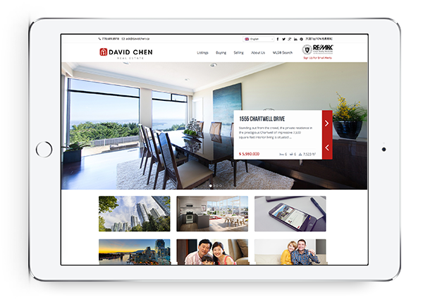
Beautiful Real Estate Websites
From simple designs to full customizations, we build powerful and elegant Real Estate websites for agents, teams, and offices around the world.
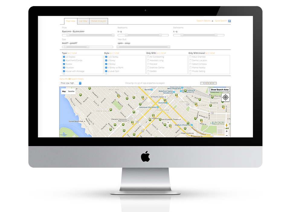
Powerful IDX with Lead Generation
Our powerful IDX feature helps your visitors effortlessly navigate through hundreds of properties on your website, allowing you to capture real time leads.
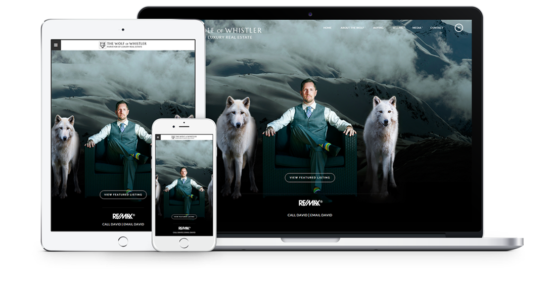
Fully responsive design
Responsive design means your site provides all functionality in a sleek design that adapts to any device or screen size.
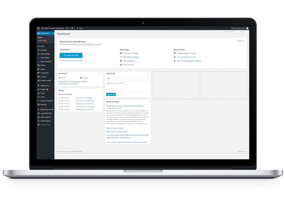
Hosting, Domain & Maintenance Included
Reliable hosting with free domain setup is included, or you can use an existing domain. WordPress is already installed on your site and we maintain it for you, so you can stay focused on what you do best – selling Real Estate!
Industry Leading Search Engine Optimization
ClickSold’s Real Estate websites are built for all the major search engines, especially Google. All the pages on your website, including all your Real Estate listings will be tailored to rank high in the searches, generating more leads for you.

Trusted by Real Estate Brokerages around the World
We’ve helped over 10,000 Realtors, brokers, and brokerages globally create beautiful, lead generating Real Estate websites.